
Anchor
Role: UX Researcher and Designer
Duration: 3 months

Problem Statement
How might we leverage and reorganize University of Michigan - School of Information’s (UMSI) resources and network to increase the success rate of finding internships and post-graduate opportunities while decreasing the cognitive load for overwhelmed students?

The Challenge
“Resources such as job boards, career events, and mentorship programs are scattered across multiple platforms, creating a fragmented and inefficient system.” -U3
This disorganization often leaves students juggling competing priorities, missing deadlines, and feeling unsupported in their career journeys.

The Goal of Anchor
Anchor streamlines the jobs & internship search process, enabling students to focus on their goals without the stress of managing disjointed tools. With a user-centered design process; we integrated critical resources into a single, intuitive platform tailored to the needs of University of Michigan - School of Information (UMSI) students.

85%
of participants reported reduced cognitive load
75%
found the mentorship feature significantly improved their networking experience
User Research
Interview Themes

User Personas


The Goals & objectives
Centralization: Combine job boards, events, and mentorship into one platform
Personalization: Include mentorship matching and filters for visa sponsorship
Guidance: Reduce cognitive load with streamlined navigation and clear workflows


Information Architecture & Key features


Usability Testing
Objective
To validate design decisions and uncover pain points, we conducted usability tests with 8 participants (See: Usability Testing Protocol F24).
Key Tasks
Navigate the Feed to find a saved job posting (See: Feed Test Script).
Use the mentorship feature to connect with alumni (See: Feed Test Script)
Findings
Positive: Students appreciated the centralized platform, with one stating, "Anchor feels like the tool I’ve always needed"
(See: Usability Testing Protocol F24).
Improvement Areas: Some users struggled with the referrals section and requested clearer labeling (See: Peer Design Critique).
Outcome
The final iteration incorporated streamlined navigation, enhanced filters, and improved mentorship workflows (See: Anchor Final Report).
Design Overview
The Feed page is a hub for students to connect with other students and alumni, keep track of any referral posts alumni may make, and post any achievements they have acquired.
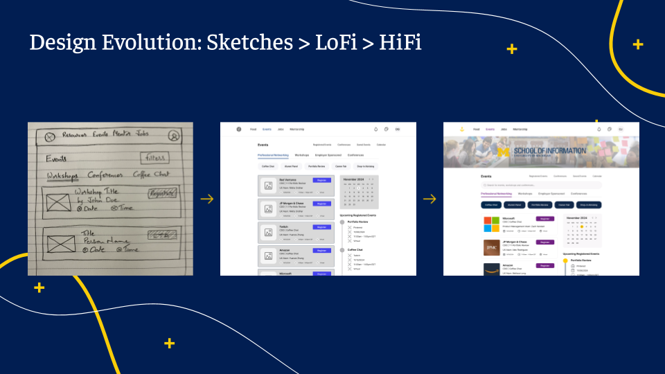
User flow of the events page which houses all of The School of Information’s events across the different offices including the Engaged Learning Office, Career Development Office, and Diversity, Equity, and Inclusion Office. There is also a built-in calendar functionality to keep track of all upcoming events.
The job page is where students can find jobs or internships related to their career field. Jobs are specific to The School of Information so you will see positions such as Product Designer, Data Analyst, Design Engineer, etc. On our referral page, the design highlights key things the hiring manager is looking for in a candidate which could include a specific major, experience on certain projects, and particular courses taken.
The University of Michigan is known to have a strong alumni base, with alumni constantly volunteering their time to help and support students through their college career. The flow shows the process of sending a mentorship request. Students can filter through alumni that best align with their future goals, comb through student feedback on how helpful an alum is, and schedule appointments to meet with alumni.
💡 Simplicity and Flow: By prioritizing Nielsen Norman’s principles of visibility and consistency, we created a straightforward navigation flow with clearly defined pathways for user actions.

Anchor Design Pamphlet
(Interact with the Pamphlet!)
