
Global
Warnming
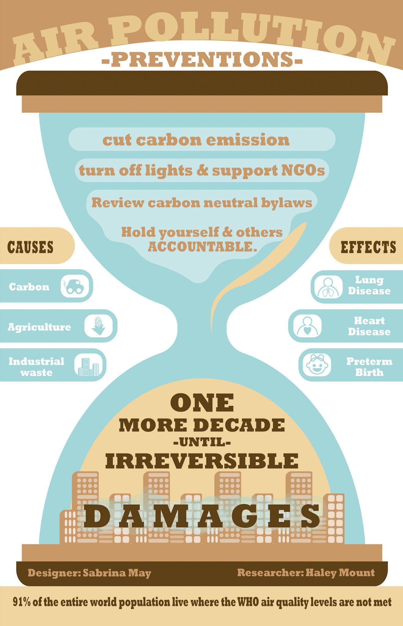
In collaboration with Haley Mount in her research on global warming—I too delved into the space of sustainability, misinformation, and poster design. I designed with a sense of urgency.
My visual focus
Hierarchy
Typography
Clear communication

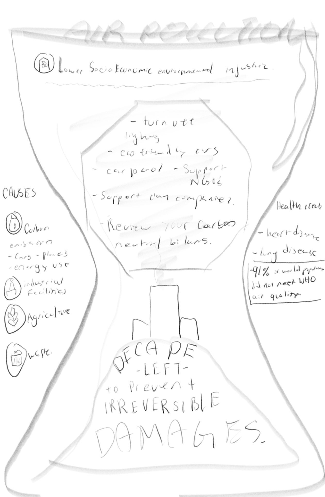
To make this illustration, I practiced icon design. Once I had a few that I felt were good, I was ready to start designing!
After peer reviews…
I changed wordings, fact checked the information, and made adjustments to the icons that I designed from scratch (to be visible from a smaller size).
We settled on three base colors.
I think an area of improvement could be the squished words at the bottom and the color contrast on the icons. I believe that I wanted to make the icons darker, however, I wanted to follow the theme that I agreed on with Haley and my reviewers.