
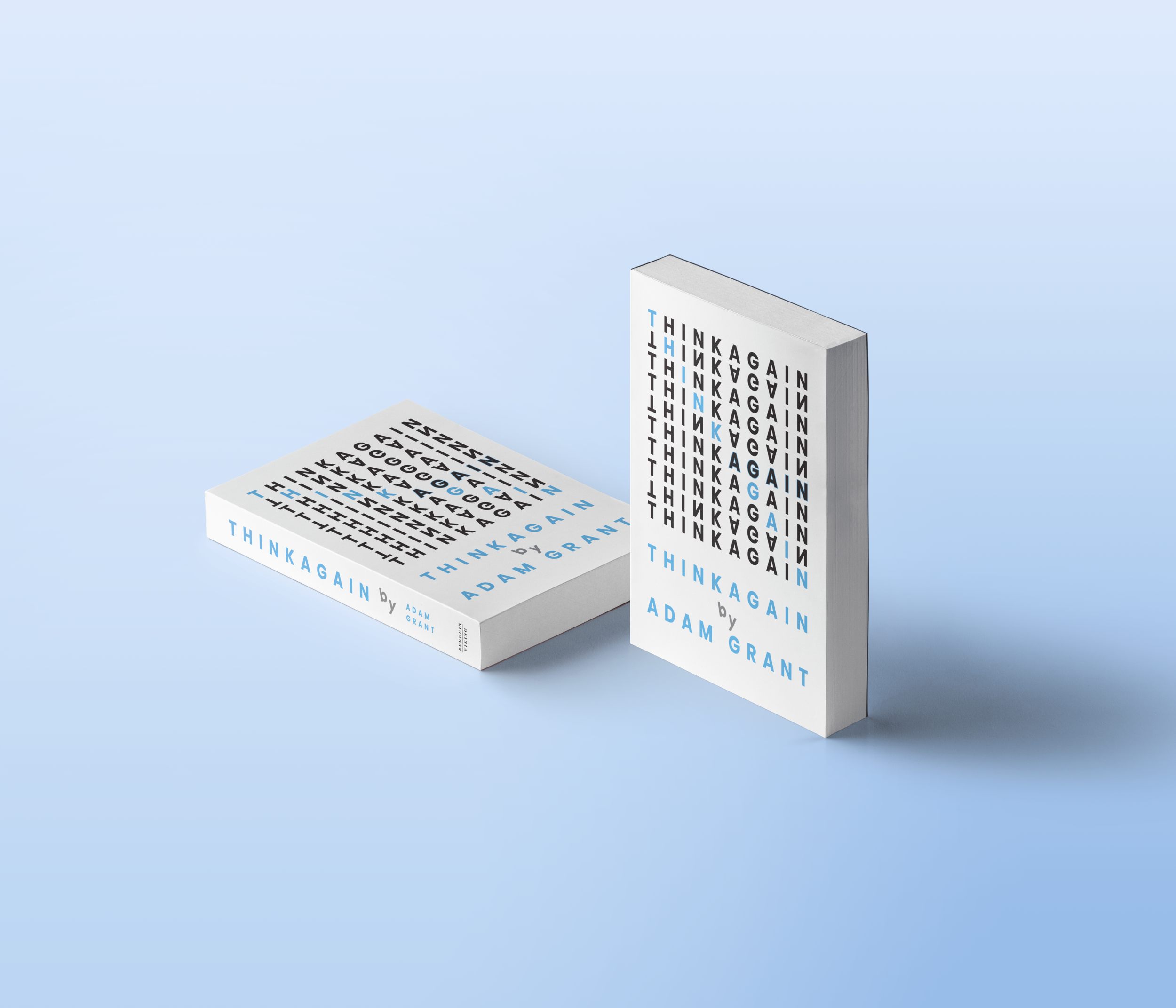
Typographic Mockup


I wanted this sleeve to play with the words as if you were to think about cognitive resilience (which is the theme that I took away from the book).
I enjoyed playing with the hierarchy of the design and rescaling the type. These factors helped keep the design clean and playful.
I chose Futura for its clean and concise look. I wanted it to be a refreshing and modern cover for yet a complex and cluttered cover. That dual approach allowed me to be more flexible and playful with the design.
I found the Typographic approach to be more challenging than the illustrative approach, however, I am more satisfied with how this cover came out.