

COVID Chronicle and Environmental Poster Case Study
A visual documentation project exploring daily life during the pandemic and the environmental impact of increased energy consumption
Introduction
This project combines two interconnected design challenges completed during the pandemic. First, I created an icon system that documented my daily routine during COVID lockdown as a visual diary. Second, using the same icon style, I expanded the system to communicate findings from a research partnership focused on energy consumption, industrial waste, and environmental risk during the pandemic. The final deliverable is an environmental awareness poster that integrates my icons with the researcher’s data.
This project allowed me to explore visual storytelling, iconography, environmental communication, and conceptual translation of real-world research into accessible design.
Part One
COVID Chronicle: A Day in the Life
Personal visual documentation of pandemic routines
Concept
This piece started as a reflection on how daily rhythms changed during COVID. With life happening almost entirely at home, I wanted to create a sequence of icons that captured both mundane and emotionally significant moments. Each icon serves as a snapshot of one action or theme in my day.
Process
I sketched and simplified each activity into minimal line based icons. My goal was to make them readable, relatable, and consistent across form, weight, and spacing.
Examples of icons created
Checking time and charging devices
Running or walking to stay active
Applying hand cream due to constant sanitizing
Meditating
Continuous hand washing
Opening blinds and staying indoors
Coding or remote work
Virtual meetings
Going outside briefly
Wearing a mask
Coming home and sanitizing
Cooking meals
Sending letters or packages
Logging mood or health
Nighttime routine
These icons became a personal timeline that visually documented the emotional and behavioral shifts of early pandemic life. The clear line work and square framing helped unify the set and made it easy to expand.
Part Two
Expanding the Icon Set for Universal COVID Meanings
As the Chronicle grew, I also created icons representing broader pandemic symbols, not just my personal routine. This included:
Quarantine
Locked homes
Online learning
Screen fatigue
CDC style mask visuals
Distanced communication
Remote hobbies
These extensions built a more complete system that could function as both a diary and a shared cultural record.
Part Three
Environmental Impact Poster
Using my icon package to visualize research on air pollution and waste during COVID
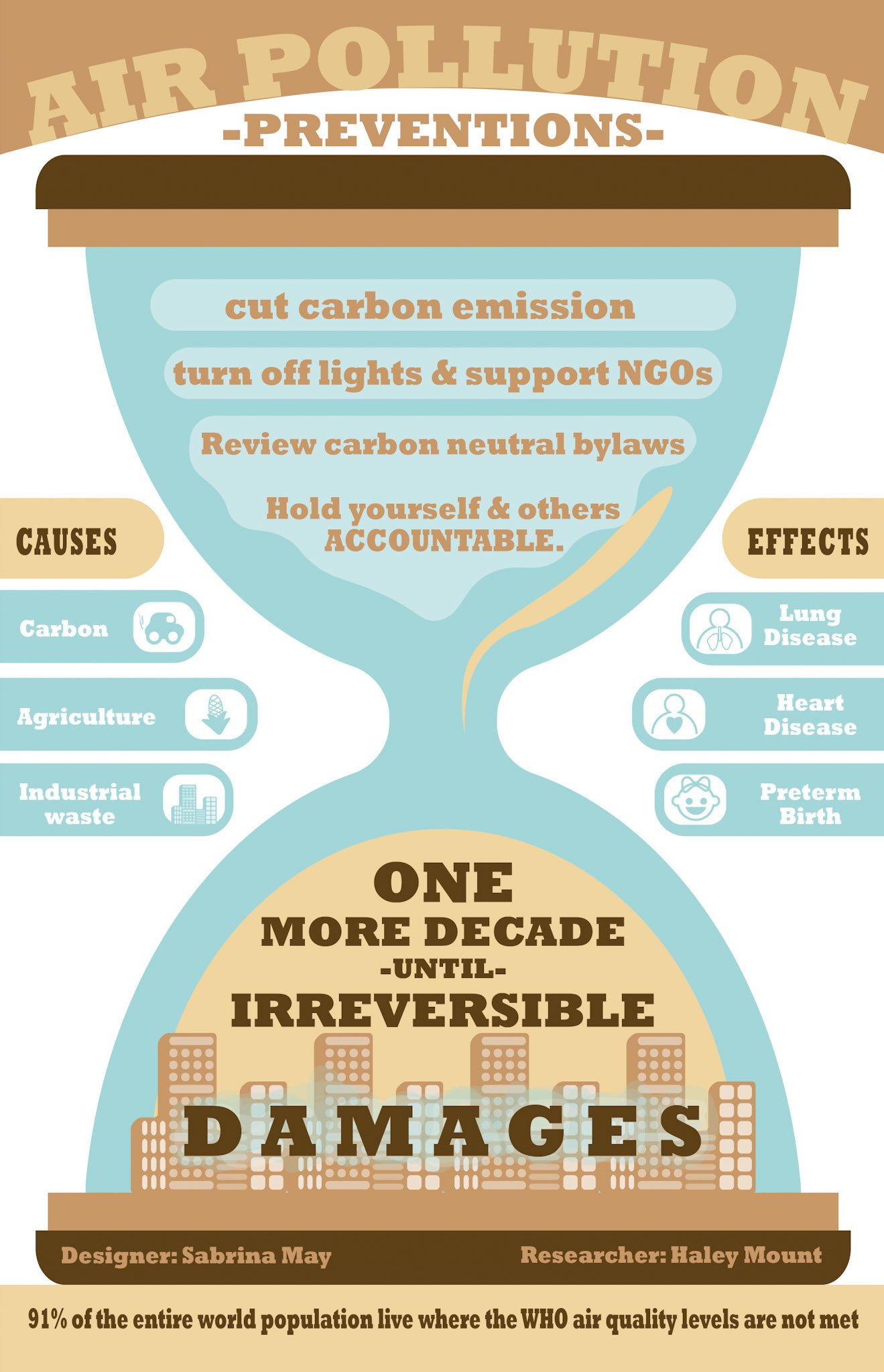
Using data from a researcher in a different department, I designed a poster that communicates the urgency of rising pollution and environmental risk. The research focused on how increased energy use, carbon emissions, agriculture, and industrial waste were amplified during the pandemic.
Concept
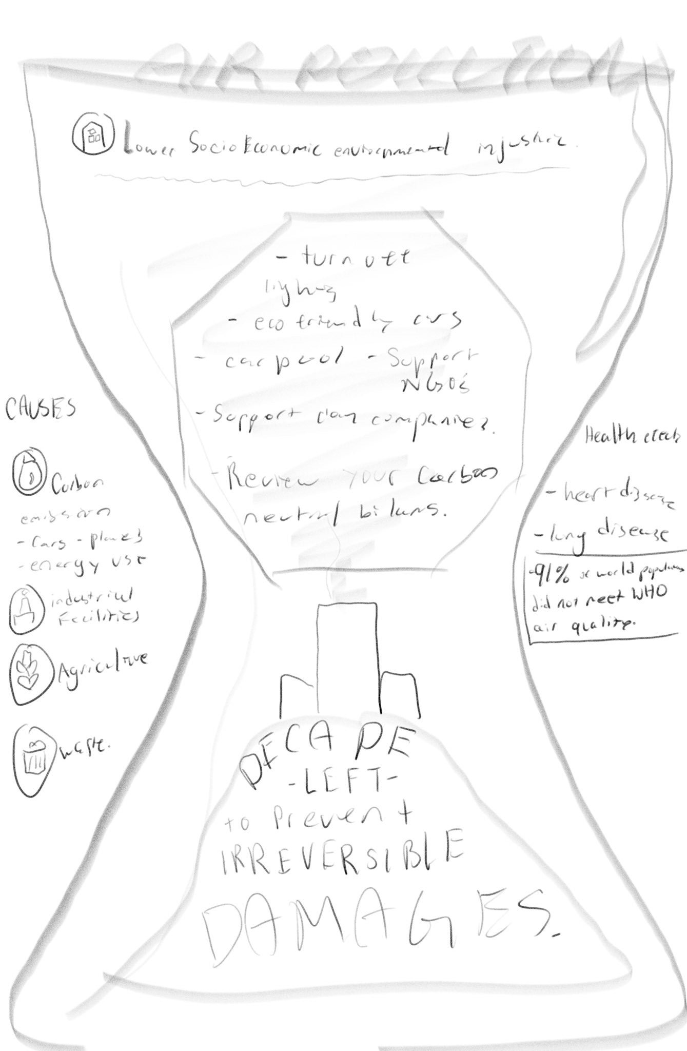
I used an hourglass as the central metaphor to communicate time running out before irreversible damages occur. The top half represents preventions. The bottom half represents consequences if action is not taken.
Icons integrated from my COVID Chronicle package
Even though the poster is about environmental issues, the unified icon style made it possible to repurpose and expand certain icons to represent:
Carbon emissions
Industrial waste
Agricultural impact
Health effects like lung and heart disease
Preterm birth risks
Energy consumption patterns
This connected the personal experience of living through COVID with the global environmental consequences unfolding at the same time.
Poster Structure
Top section: prevention behaviors and personal accountability
Central hourglass: symbol of urgency and limited time left
Left side: causes of pollution
Right side: health effects
Bottom: the warning that there is only one decade left to prevent irreversible global damage
I used warm earth tones and rounded shapes to balance the seriousness of the topic with visual accessibility.
Reflection
This project pushed me to think of design systems not as isolated pieces, but as flexible visual languages that can scale from personal storytelling to global communication. Creating icons for my own daily life taught me how to simplify visual form. Expanding the icons into research communication taught me how to adapt aesthetic choices to serve complex scientific messages.
Together, the Chronicle and poster illustrate how visual design can make both personal and global narratives more understandable and relatable.
