
Lunatix Type Specimen
A visual exploration of character form, contrast, and typographic personality
indesign poster lunatix
Introduction
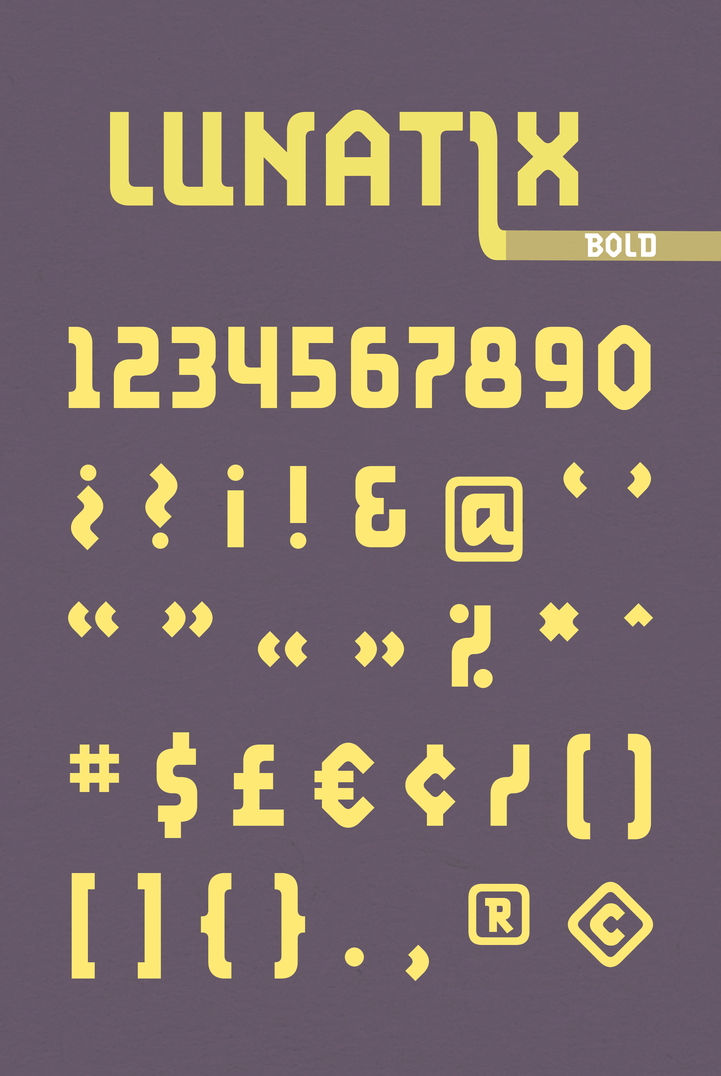
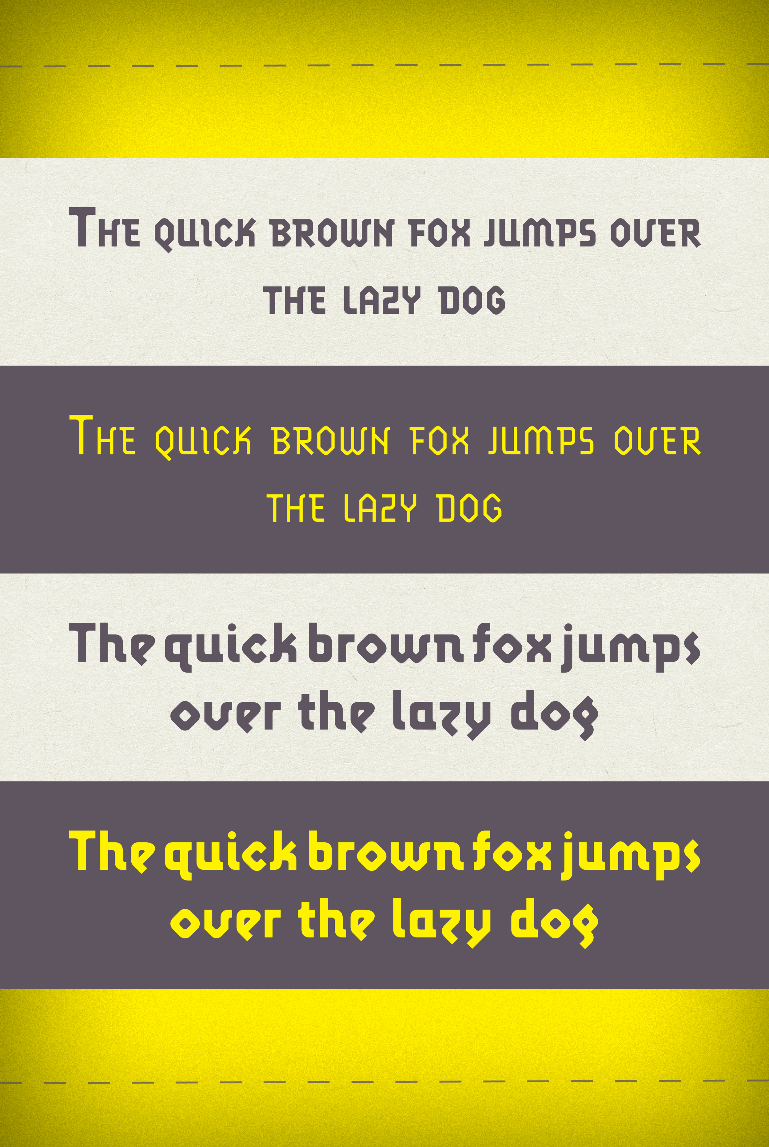
This poster showcases Lunatix, a geometric display typeface with both light lowercase and bold uppercase styles. The goal of the design was to highlight the contrast between these two weights while emphasizing the rhythmic, modular nature of the letterforms. I wanted the poster itself to feel like a controlled experiment in type, showing how Lunatix shifts mood, presence, and texture when scaled, layered, and contrasted against fields of color.
Concept
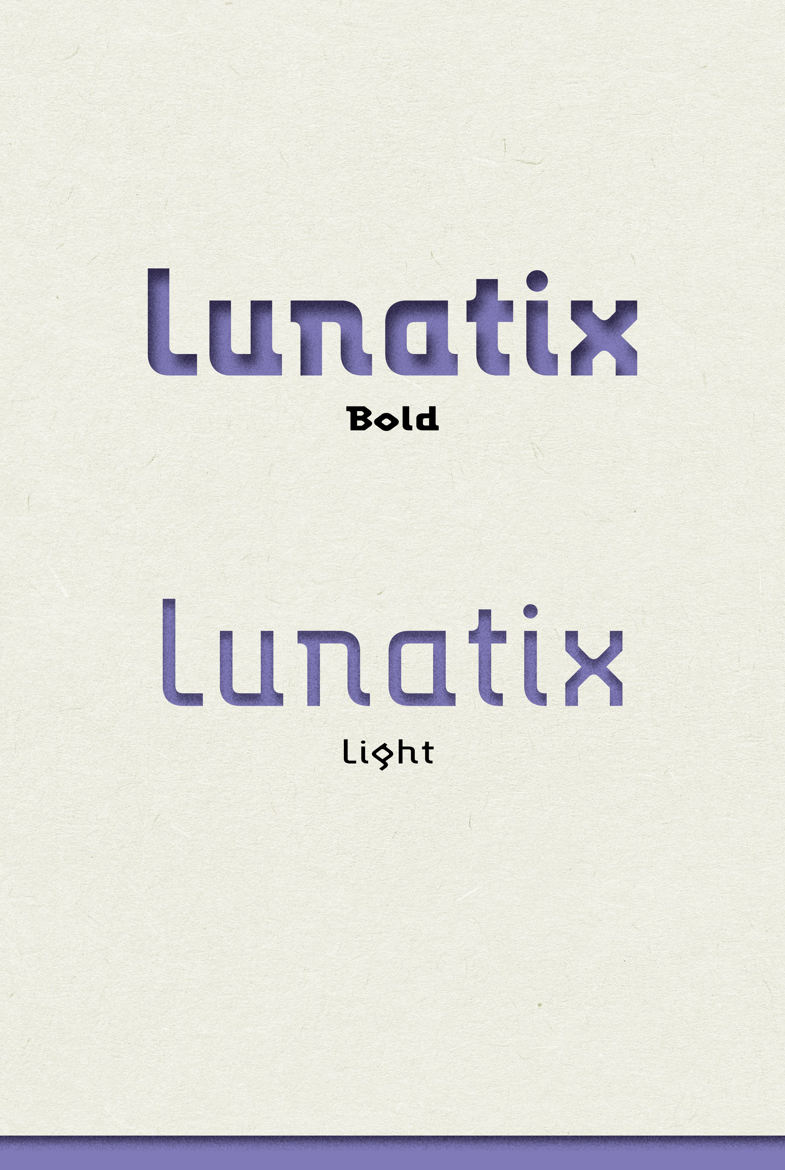
The concept behind this specimen was to showcase Lunatix as a typeface with dual identities. The light lowercase communicates an airy, experimental softness, while the bold uppercase feels structured, assertive, and architectural. By dividing the poster into horizontal bands, I created a controlled stage where the type could be examined in isolation, almost like a sequence of typographic test strips.
The yellow glow and paper texture were intentional choices to make the letters feel dimensional, as if they were cut through layers and illuminated from beneath. This approach adds depth and draws attention to the unique geometry of each character.
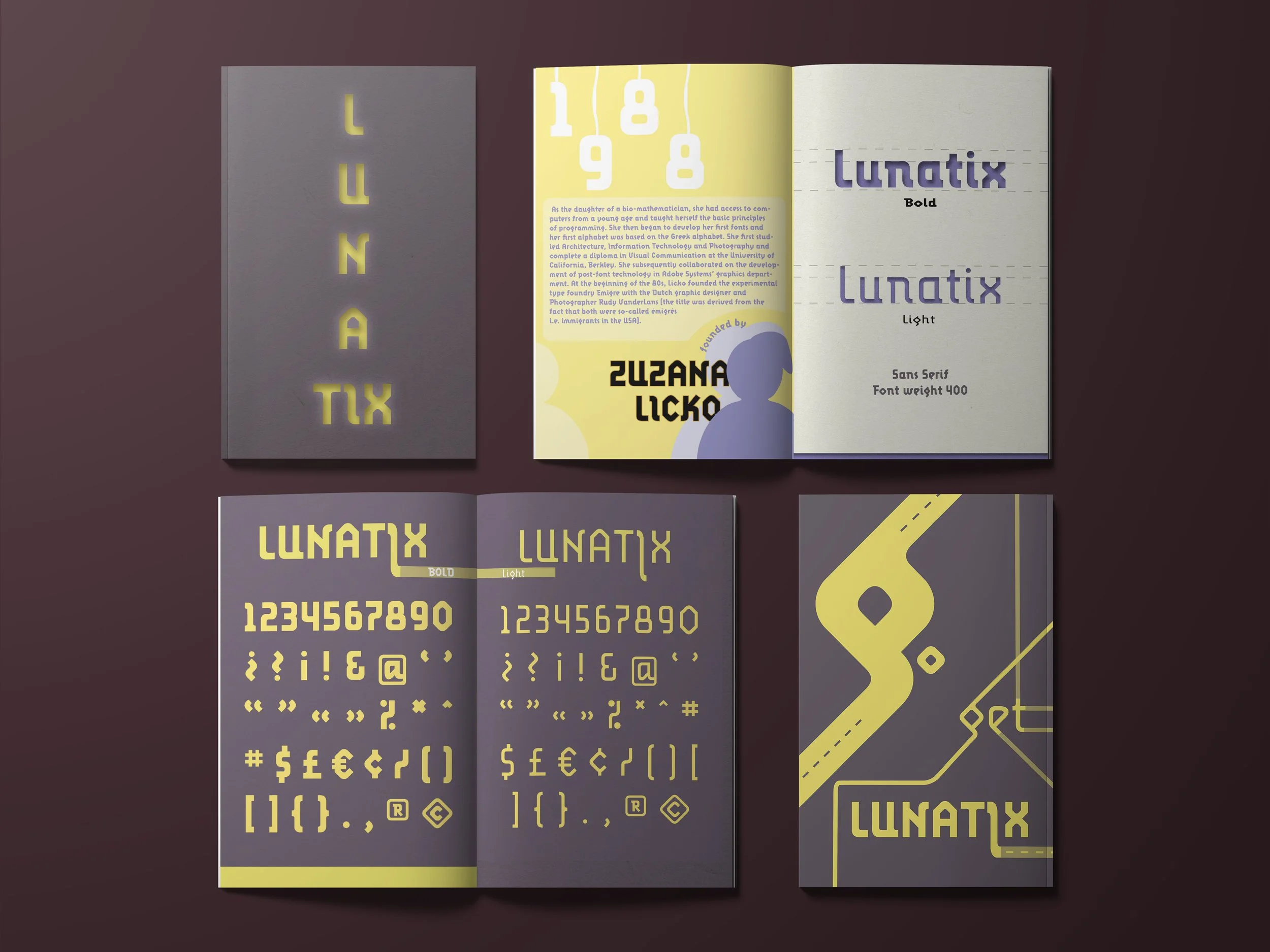
Foldable Pamphlet of Lunatix
Process
Step 1: Studying the Typeface
I began by analyzing the internal logic of Lunatix. The typeface has distinct geometric cuts and angular moves that become more pronounced when enlarged. I studied the rhythm of the lowercase versus the stance of the uppercase to understand how each weight communicates differently.
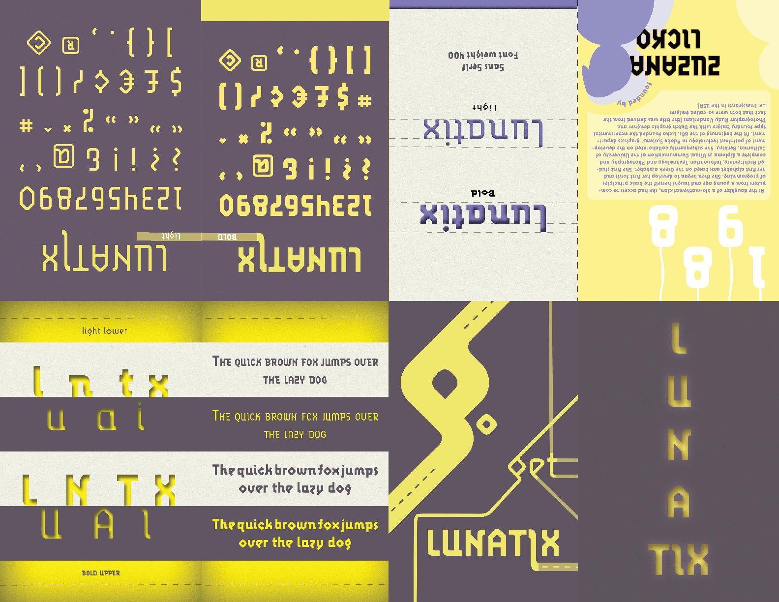
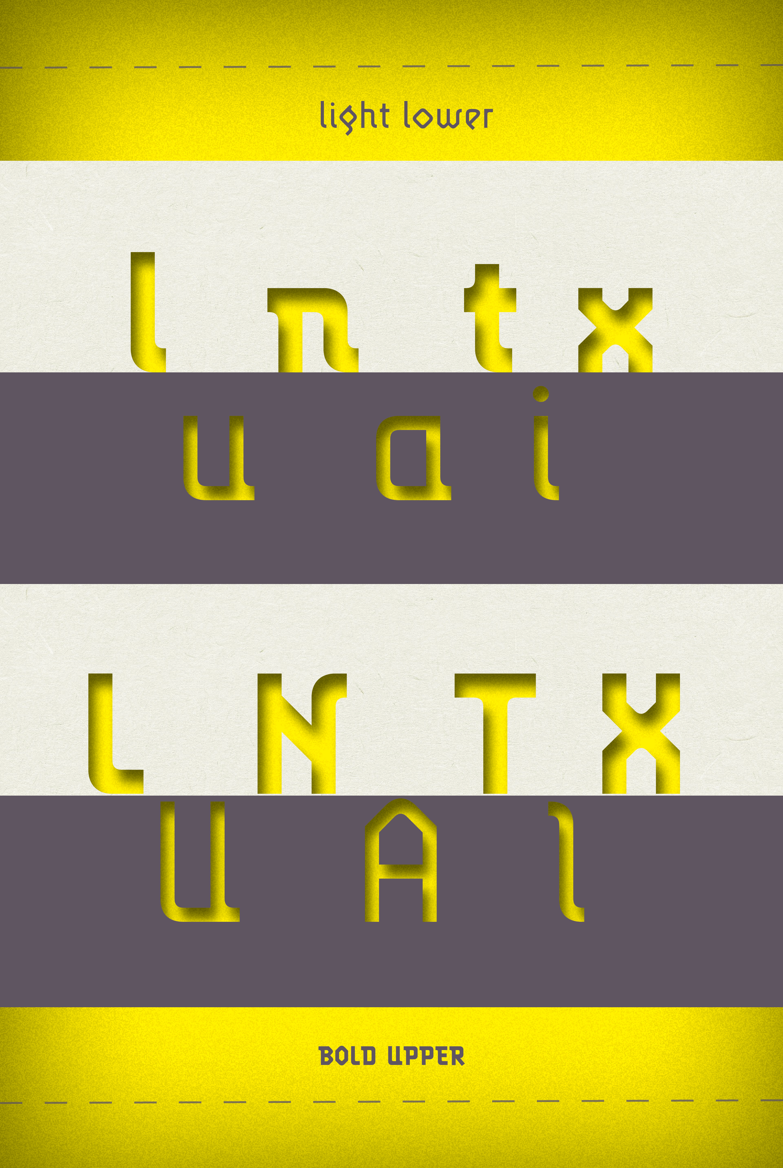
Step 3: Highlighting the Lowercase
The “light lower” section uses soft tonal gradients to emphasize the delicacy of the lighter weight. The characters appear almost carved out, revealing a warm yellow glow from behind. This gives the lowercase letters an ethereal, experimental quality that matches the personality of Lunatix.
Step 4: Displaying the Uppercase
For the “bold upper” section, I emphasized weight and presence. The uppercase letters feel grounded and monolithic. The same glow effect takes on a different meaning here, giving the bold characters a sense of depth and structured geometry.
Step 2: Designing the Grid
To control how the letters were displayed, I created a horizontal band system. Each band isolates a grouping of characters, allowing viewers to focus on shape, counterform, and structure without distraction. This also allowed me to show how Lunatix behaves in both small and large scales.
Step 4: Displaying the Uppercase
For the “bold upper” section, I emphasized weight and presence. The uppercase letters feel grounded and monolithic. The same glow effect takes on a different meaning here, giving the bold characters a sense of depth and structured geometry.
Step 5: Using Color and Texture
The palette of warm yellow, soft paper white, and muted gray creates a balance between vibrancy and restraint. Yellow is used as a highlight color that activates the letterforms. The muted textures keep the poster from feeling overly digital, bringing warmth into what is otherwise a geometric and mechanical type family.

Final Design
The final specimen is intentionally minimal in content but rich in visual detail.
It functions as:
A display of Lunatix’s structural qualities
A comparison between light and bold styles
A visual study of shape, depth, and rhythm
A modern interpretation of type specimen poster tradition
The glow, layering, and large-scale cropping push the letters into an almost sculptural space, making Lunatix feel more tactile and expressive.
Reflection
Working on this poster helped me better understand the expressive potential of type when shown at different scales. It pushed me to consider texture, color, and structure as part of typographic storytelling. Rather than simply presenting the typeface, I created an atmosphere around it, revealing its personality through composition and contrast.