
Typographic Book Cover Case Study
A visual exploration of cognitive resilience through type
Introduction
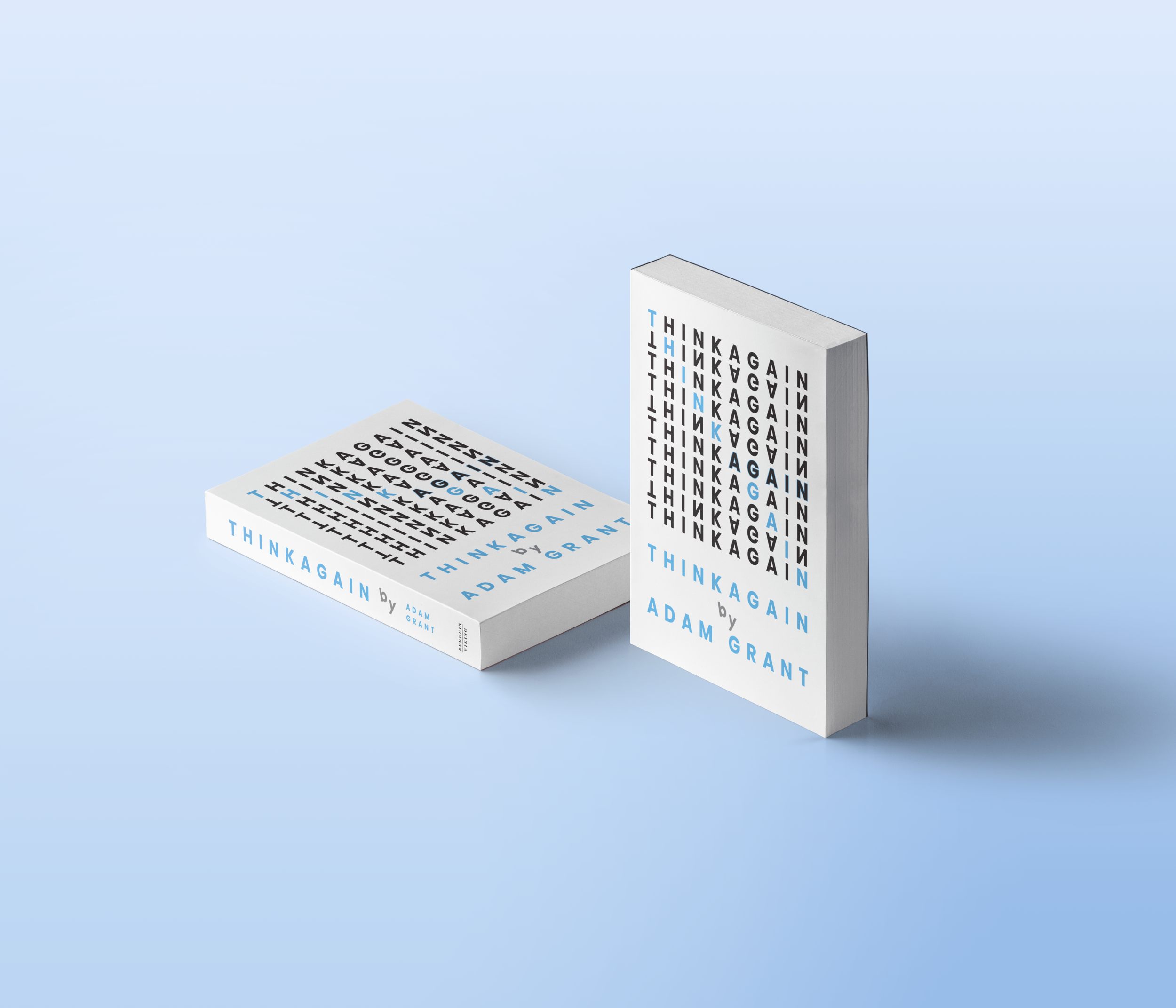
This project asked me to design a typographic book cover that communicated a key theme from the text. I chose to focus on the idea of cognitive resilience, which I interpreted as the ability to adapt, reorganize, and regain clarity when faced with complexity. My goal was to express this concept through type alone while maintaining a modern and refreshing aesthetic.
Problem Framing
The challenge was to communicate a reflective, psychological theme using only typography. Without imagery, the design needed to rely on hierarchy, scale, spacing, and type selection to convey the idea of mental flexibility.
Key questions I asked myself included:
How can typography visually represent the process of reorganizing thoughts
How can hierarchy guide the reader while still expressing disruption
What typeface supports a clean and modern look suitable for a complex theme
Process
Step 1: Concept Exploration
I began by identifying cognitive resilience as the main idea that should guide the design. I looked for ways to make the type feel active rather than static. I wanted the words to move, shift, and breathe, almost as if mimicking the mental process of regaining clarity.
Step 2: Hand Lettering Practice
Before transitioning to digital design, I spent time hand writing the alphabet and short phrases. This helped me understand how letterforms interacted with positive and negative space and how the design would sit against a white background. Practicing by hand gave me a grounded feel for spacing, weight, and contrast that informed the digital layout.
Step 3: Playing with Hierarchy
I experimented with different ways of rescaling and repositioning the type. Adjusting hierarchy allowed me to create a sense of movement and resilience while keeping the composition clean. This playful approach helped maintain clarity despite the conceptual complexity.
Step 4: Selecting the Type Family
I chose Futura for its geometric precision and clean form. Its simplicity and modern presence created a refreshing contrast to the challenging theme of the book. This duality allowed the cover to feel both structured and flexible, aligning with the idea of resilience.
Step 5: Digital Exploration and Refinement
I created multiple digital compositions, testing spacing, alignment, and scale. I refined the structure until the type felt balanced, intentional, and visually open. The final layout uses variation in size and arrangement to express adaptation while maintaining a strong sense of order.
Final Design
The final cover is clean, modern, and conceptually aligned with cognitive resilience. The shifting hierarchy and subtle variations in scale create a sense of movement, while Futura’s geometry keeps the design grounded and approachable.
Reflection
The typographic approach challenged me more than an illustrative one, but it pushed me to think more critically about form and meaning. Working within the constraints of type helped me deepen my understanding of hierarchy, rhythm, and spatial balance. I am more satisfied with this cover than the illustrative version because it feels deliberate and aligned with the theme I wanted to express.
The original thought process…


